As our new website has just gone live, it’s probably a bit late to be reflecting upon last year. However, there are a number of projects which are on-going and since it’s also been our first year of trading, there is some work we have to mention!
Glennans ~ vegetable crisp packaging
Without doubt, this has been the highlight of the year. Working in collaboration with The Ideas Facility, we have helped re-position this gourmet product for the consumer market. This includes brand development, re-shaping the proposition and of course, new packaging.
Glennans are a family business based in Staffordshire, who have been making a range of vegetable crisps for 20 years now. Their market is well established within the catering trade and in particular ‘own’ label – as suppliers to supermarkets such as Aldi, Asda and Tesco. But they wanted to tap into the consumer market with the launch of a new six bag multi-pack.
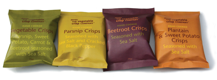
The solution – clean and understated, this typographical approach uses a ‘naturalistic’ palette (colour coded to each product) and bold use of type for differentiation. A good example of that great design mantor ‘less is more’ and we believe, a perfect solution which will help this product stand out in a competitive marketplace. In fact, it is already flying off the shelves (literally!) in Waitrose and Tesco’s.
We are deeply passionate about type and believe that this is a valuable design resource which is often overlooked or mishandled (even by some designers!) so we’re even more delighted that Glennans have chosen this design option. The work we produced for Glennans included;
- Brand identity – analysis, recommendations and re-shaping the proposition
- Packaging design and artwork for 27, 40, 100g packs and multi-pack bag
- Press advertising.
- In collaboration with The Ideas Facility, we are now looking at the marketing strategy, website, vehicle livery and brand guidelines manual for Glennans.
- We have also entered the packaging for the NYTDC (New York Type Directors Club) design competition. Fingers crossed!
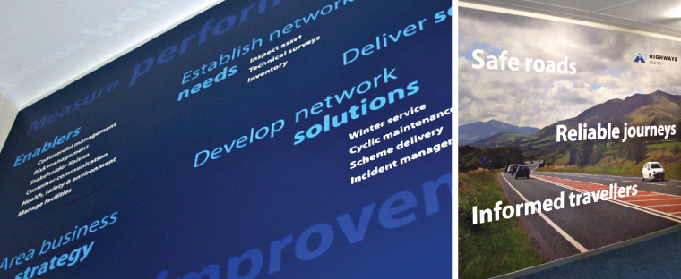
EnterpriseMouchel ~ office interior design
The summer saw the completion of new office signage and interior ‘feature’ or ‘graphic’ walls for EnterpriseMouchel’s office in Penrith. EnterpriseMouchel manage the road network in Cumbria. A good working environment has a positive influence on the people who work in it, and these graphic walls certainly have the ‘wow’ factor. Not only do they re-inforce the organisations objectives, they also communicate a clear message to the client, The Highways Agency.
We designed ‘supergraphics’ for two feature walls. One was a typographical approach which highlights key objectives for EnterpriseMouchel, whilst the second was photographically led, featuring a local highway and endorsed by the Highways Agency strap line. Both walls were 2.5m high by 3.5 m wide and the graphics used a combination of direct colour printing onto foamex panels with cut vinyl lettering for enhanced visual impact. This was produced in collaboration with The Ideas Facility and The Advance Consultancy.
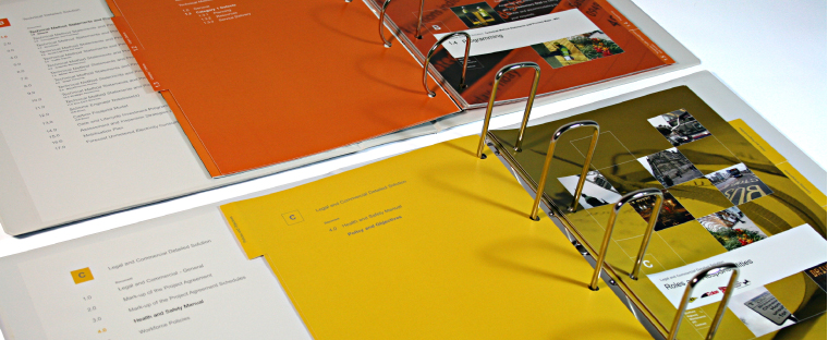
Colas Scott Wilson ~ tender submission design
The start of the year was welcomed in with business development work, in the form of the above tender submission.This was for a joint venture between two companies; civil engineers Scott Wilson and highway service providers Colas, to win a multi-million pound contract for highways maintenance work in Sheffield.
Without a shadow of a doubt, it was the biggest bid we have ever been involved in. The design was photographically led, and was based on a grid structure which gave the submission a ‘technical’ feel. We commissioned photography of Sheffield to communicate key messages and demonstrate an understanding of the City. Each folder was colour-coded according to specific categories. The work we produced for this included;
- The provision of (word) templates for the bid team
- Photography and art direction
- Bid design (and the design of over 400 individual artworks)
- Print management.
The bid was so big, it required a transit van for delivery! This was produced in collaboration with The Ideas Facility and The Advance Consultancy.