All the sleeves were for Pete Waterman Limited (PWL) the music being dance orientated. (We are talking post Kylie and Jason Donovan!) Most of the music originated from Europe and was sold under licence in the UK. They were all designed in the early nineties in the ‘traditional’ sense – although the mac was around, it certainly wasn’t mainstream so these were all put together with the drawing board. Seems like a different era. It was!
Design and artwork
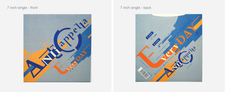
Each sleeve was designed and artworked in around three days time, usually allowing around a day or so, for concepts and a day for artworking. It may sound easy, but it was far from it. Most of the time, we didn’t even get to hear the music – we were faxed the title of the song and the artist plus a few legal details and that was it. But it was good fun and made a pleasant change from the ‘corporate’ work which was always on-going. What we did know was that all this music had a very contemporary edge to it, not quite pop but dance orientated, experimental and mostly high energy. So, the design of the sleeves related to an aspect of the title or music name. We faxed through initial design concepts (3, 4 at the most) one of these was chosen, and then straight to artwork. Each sleeve was artworked to four formats; 12″, 7″, MC and CD.

Tight budgets
I recall that we charged £750 for each sleeve. It may sound like a lot, but it wasn’t considering the amount of work that each required. There was also very little (if any) budget for commissioning photography or illustration and therefore a more graphic approach was the preferred option.

Some of the titles may have made the top 40, but a few were massive hits. The 2 unlimited ‘get ready for this’ reached no 2 in the British charts and, I believe sold more than 650,000 worldwide. I am certain that the sleeve design was a key part of its success. Oh, if only I’d been paid royalties! I recall that before sending the artwork off to London we were still struggling to decide what colours to use. It was 7pm (or so) the artwork was complete and the couriers were on their way to pick it up! Inspiration struck at the last minute (phew!) and the decision to use solid process colours (cyan, magenta, yellow and black) Good call. I was happy with the design, but what colour to use?


Paying the rent
I recall that at one point we were designing four to five sleeves each month. We did a deal with Pete Waterman, which resulted in no rental charged for the studio space, in return for one ‘free’ sleeve design. Ah, those were the days!