We’ve been working with the YMCA in Stoke-on-Trent for well over 18 months now. Following a £9m allocation for capital redevelopment and the creation of a new youth campus, Tilley and Associates were appointed to help with their marketing strategy, communications and promotional requirements.
The scope of work has included;
- Communication and marketing strategy
- Brand identity re-design and implementation to:
- Signage – interior and exterior; directional and locational
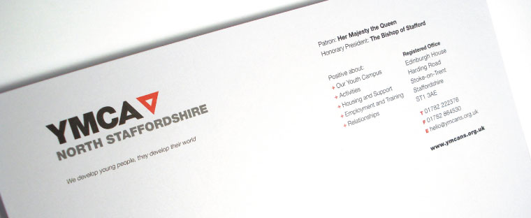
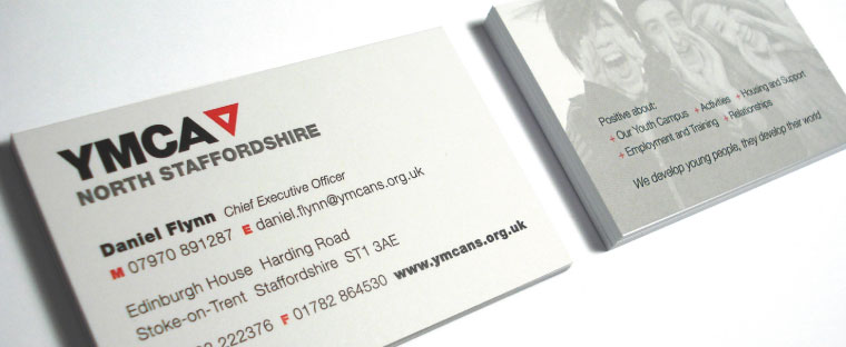
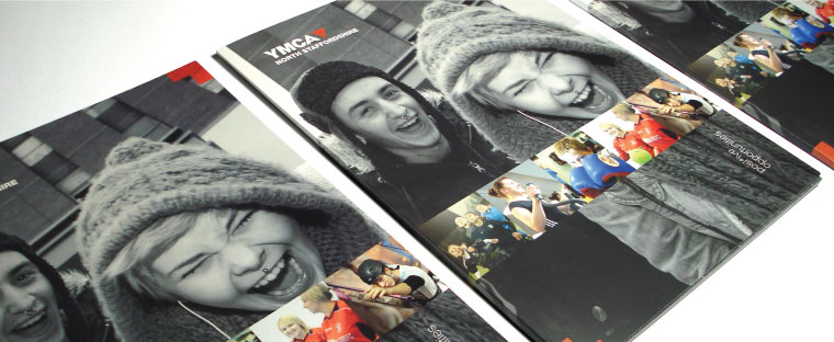
- Stationery and suite of marketing collateral, including a literature pack
- Website (view here)
- Photography – planning and art direction
- Brand toolkit (communication / identity guidelines)
- Vehicle livery
- Reception supergraphics (exterior)
- Youth Health Zone branding and implementation.
Logotype development
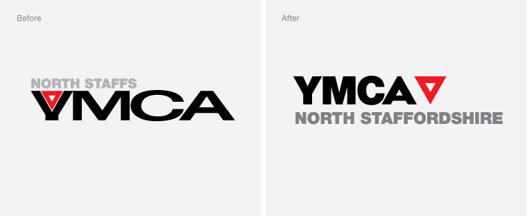
One of the first things we looked at was the branding. Although the YMCA is an international organisation, branding and identity differs from country to country and region to region. The common single denominator is the red triangle – representing ‘body,’ ‘mind,’ and ‘spirit,’ and is used globally throughout the YMCA. There were two major concerns with their existing logotype:
1 The ‘Y’ was often misread as a ‘V’, and
2 The hierarchy of ‘YMCA’ and ‘North Staffs’ was felt to be the wrong way round. (The words ‘North Staffs’ was also disliked – so this was changed to North Staffordshire).
We explored a number of both radical and evolutionary options – before settling on a cleaner, modern design. This logotype features a specially drawn letter ‘A’, the shape mirroring that of the triangle and therefore dovetailing as a single unit. The logotype also complemented the contemporary design of the new build.
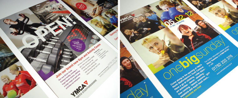
Marketing campaign
The new logotype was also supported by a marketing campaign, focussing on a ‘positive opportunities’ message. A graphic ‘palette’ was created for this and the campaign was developed to promote individual services, in addition to the organisation as a whole. For example, Employment and Training, became Positive about Employment and Training.
This has been a great opportunity for Tilley and Associates and we have enjoyed working with the YMCA across such a broad range of work. Over the coming weeks we will be posting some more updates about the range of work completed for this client.
“Eric Tilley has helped the YMCA in North Staffordshire think about how it can communicate its message to a wider customer base in the community across the geography we serve. He has helped us hone our messages and service offer, helped us target our customer focus and produced new marketing material including a rebranding of our corporate logo and badging. The process he used was fantastic getting alongside us spending time to get underneath our challenge, he was the first marketing professional who ‘didn’t try to sell us something’ rather helped us to understand how we can best utilise the fantastic opportunity we have.”
– Daniel Flynn, Chief Executive.


One Trackback
[…] http://www.tilleyandassociates.co.uk – Today, 9:24 AM Rescoop […]